

The count table, a numeric matrix of genes × cells, is the basic input data structure in the analysis of single-cell RNA-sequencing data. A common preprocessing step is to adjust the counts for variable sampling efficiency and to transform them so that the variance is similar across the dynamic range. These steps are intended to make subsequent application of generic statistical methods more palatable.
EMBL researchers describe four transformation approaches based on the delta method, model residuals, inferred latent expression state and factor analysis. The researchers compare their strengths and weaknesses and find that the latter three have appealing theoretical properties; however, in benchmarks using simulated and real-world data, it turns out that a rather simple approach, namely, the logarithm with a pseudo-count followed by principal-component analysis, performs as well or better than the more sophisticated alternatives. This result highlights limitations of current theoretical analysis as assessed by bottom-line performance benchmarks.
Benchmark Results
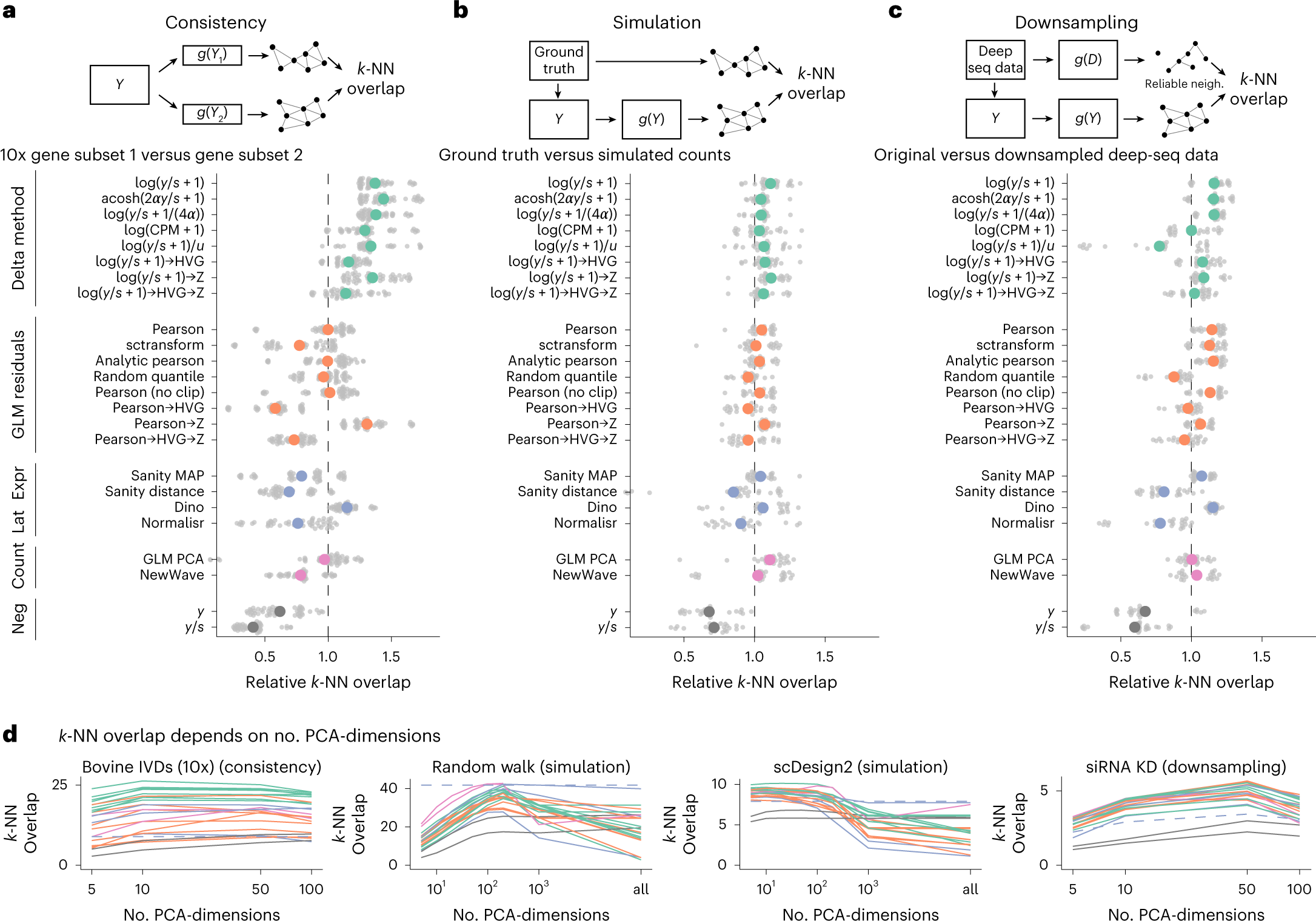
a, Overlap between the k-NN inferred separately on two halves of the data. The colored points show the averages across ten datasets, each with five replicate random data splits (small, gray points). b, Overlap between k-NN inferred from simulated data and ground truth, using five simulation frameworks and five replicates per framework. c, Overlap between a reference k-NN graph (inferred using all transformations on deeply sequenced data and taking the intersection) and the k-NN inferred on data downsampled to match typical 10x data (5,000 counts per cell) for five datasets with five replicates each. To compare and aggregate results across the different datasets, Relative overlap (a–c), which was computed by dividing, for each dataset, the overlap by its average across all transformations, fixing k = 50 and using a dataset-specific number of PCA dimensions (Extended Data Fig. 7 shows the underlying, unaggregated data). d, Overlap (y axis) as a function of PCA dimensions (x axis); the different transformation types are indicated by the colors, using the same palette as in a–c. The performance of Sanity Distance is shown as a dashed line.
Ahlmann-Eltze C, Huber W. (2023) Comparison of transformations for single-cell RNA-seq data. Nat Methods 20(5):665-672. [article]


